User Interface: Difference between revisions
From The Blockheads Wiki
>Cdrras |
Tag: Undo |
||
| (19 intermediate revisions by 7 users not shown) | |||
| Line 1: | Line 1: | ||
{{ | {{outdated}} | ||
The components of the user interface are how a player instructs and interacts with the blockheads they control in the game. | |||
==Main Interface== | ==Main Interface== | ||
[[File:Blockhead Interface.png|500x400px|right|thumb|User Interface on an iPhone]] | |||
The main interface fills the device's display with a view of part of the active [[world]] surrounded by various controls and displays. Summoned windows tend to appear in the middle of the display. | |||
===Layout and Usage=== | ===Layout and Usage=== | ||
# [[Blockhead]] | # [[Blockhead]] | ||
# [[Portal]] | # [[Portal]] | ||
# Menu Button | # [[Pause Menu|Pause]] Button | ||
# [[Time Crystal]] | # [[Time Crystal]] | ||
# [[Blockhead]] name | # [[Blockhead]] name | ||
# [[Health Bar]] | # [[Health Bar]] | ||
# [[Happiness Bar]] | # [[Happiness Bar]] | ||
# Character Status | # Character Status Icon | ||
# Hand | # [[Hand]] | ||
# Item Slot for [[ | # Item Slot for [[clothing]] of feet | ||
# Item slot for | # Item slot for clothing of lower body | ||
# Item slot for | # Item slot for clothing of upper body | ||
# Item slot for | # Item slot for clothing for head | ||
# Single item slots | # Single item slots | ||
# [[Basket]] with expanded item slots | # [[Basket]] with expanded item slots | ||
==Character Status Window== | ==Character Status Window== | ||
[[File: | [[File:Character Status Window.png|200x250px|right|thumb|Character Status Window]] | ||
The character status window is summoned by tapping the character status icon for the active blockhead. | |||
===Layout and Usage=== | ===Layout and Usage=== | ||
# [[Health Bar]] | # [[Health Bar]] | ||
| Line 29: | Line 34: | ||
# [[Environment Bar]] | # [[Environment Bar]] | ||
# Character status | # Character status | ||
# Warp in [[ | # Warp in [[workbench]] button | ||
# [[ | # [[Meditate]] button | ||
# [[Sleep]] button | # [[Sleep]] button | ||
==Other Components== | ==Other Components== | ||
[[File: | [[File:Character Status Icon Zoom.png|thumb|right|Air Bar and Death Bar]] | ||
# [[ | [[File:Welcome Back.png|thumb|right|Welcome Back]] | ||
Some components, such as the death and air bars or some [[inventory]] slots, will appear adjacent to another component instead of in the middle of the display. | |||
===Layout and Usage=== | |||
# [[Air Bar]] | |||
# [[Death Bar]] | |||
# Welcome Back | |||
==iPad | ==Device Differences (iPad/iPhone/iPod/other)== | ||
Each component is of a consistent size in pixels. Their arrangement and proportion to the entire display is affected by the resolution of the device and its orientation. | |||
[[Category:Guide]] | [[Category:Guide]] | ||
Latest revision as of 01:52, 5 September 2024
Parts of this article are outdated, and need to be updated.
You can help The Blockheads Wiki editing it to reflect a recent update.
The components of the user interface are how a player instructs and interacts with the blockheads they control in the game.
Main Interface

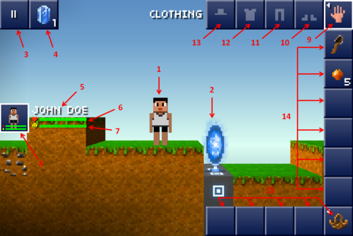
The main interface fills the device's display with a view of part of the active world surrounded by various controls and displays. Summoned windows tend to appear in the middle of the display.
Layout and Usage
- Blockhead
- Portal
- Pause Button
- Time Crystal
- Blockhead name
- Health Bar
- Happiness Bar
- Character Status Icon
- Hand
- Item Slot for clothing of feet
- Item slot for clothing of lower body
- Item slot for clothing of upper body
- Item slot for clothing for head
- Single item slots
- Basket with expanded item slots
Character Status Window

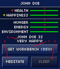
The character status window is summoned by tapping the character status icon for the active blockhead.
Layout and Usage
- Health Bar
- Happiness Bar
- Hunger Bar
- Energy Bar
- Environment Bar
- Character status
- Warp in workbench button
- Meditate button
- Sleep button
Other Components


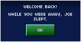
Some components, such as the death and air bars or some inventory slots, will appear adjacent to another component instead of in the middle of the display.
Layout and Usage
Device Differences (iPad/iPhone/iPod/other)
Each component is of a consistent size in pixels. Their arrangement and proportion to the entire display is affected by the resolution of the device and its orientation.
